Gantt Chart
The Gantt Chart is a view that includes active, past and future instance data. It combines time-of-day, elapsed time and workflow relationships in one view. Use of the Gantt Chart allows you to visually see when a workflow executed, how long it ran, and its completion status. You can also see what workflows ran at the same time.
Each row consists of the object’s name on the left and a color-coded bar on the right, indicating the object's instance(s) start and ending time (if the instance has completed). The date and times are listed horizontally so you can scroll in either direction to view all the displayed instances. In the leftmost section of the chart, clicking on the arrow icon of an object expands the object to show you the completed instances. Multiple instances are shown on a single line. The boxes of the Gantt chart represent the Plans and Jobs that have either completed, are currently running or will execute in the future. The sizes of the boxes are based on either actual elapsed times or expected elapsed times based on initial run-time or historical averages.
The filter bar allows you to refine the display by date range and/or time range as well as state (e.g. failed, succeeded, etc.), tags and Queues. The start and end date/time filter fields are only enabled when Custom is selected from the date filter dropdown. Additional information about the workflow itself can be obtained by hovering over the various objects which produces an informational tooltip.
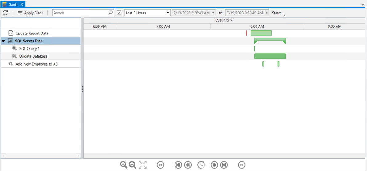
In the image below, Update Report Data ran twice during the 8:00 AM timeframe; the first time it failed (observe the red line). The second time it ran for a longer period of time and succeeded. Next, the SQL Server Plan consists of two Jobs, SQL Query 1 and Update Database. SQL Query 1 ran for a short period of time and succeeded. Update Database also succeeded, but it ran for a longer period of time. Lastly, the Add New Employee to AD Job ran twice in the 8:00 AM timeframe, and both instances succeeded.
Buttons along the bottom of the Gantt view allow you to zoom in, out or zoom-to-fit. Direction arrows allow you to scroll or pan in either direction. The clock icon, when enabled, allows for auto-scrolling based on the current time. You can tell when auto scrolling is enabled, as you will see a long vertical bar displayed near the current time. As the day progresses with auto scroll enabled, current activity will be towards the center of the display.
Gantt Chart Toolbar
The toolbar options are described below, from left to right.
Refresh - The leftmost icon is the refresh data icon. Refreshing the data is required when you change the date/time filter because new data must be retrieved from the backend database.
Apply Filter - This option filters the currently displayed data when you filter by State, Tags or Queues. This does not require fetching new data from the backend database.
Search - This option allows you to enter the label of an object. Only objects that match what you enter in the search textbox will remain in the view.
Date - The checkbox to the right of the search option enables the date/time filter. You can set the date and time by selecting the "Custom" option from the dropdown list, or you can select one of the canned options. After making a selection, click the refresh icon.
State - This option lets you filter by state (e.g. failed, waiting, aborted, etc.). You can include all states, or check on specific states as displayed in the dropdown list. Click the Apply Filter button after making your selections.
Tags - This option lets you filter by tags. The dropdown list displays built-in and user defined tags (if any) to choose from. Click the Apply Filter button after making your selections.
Queues - This option lets you filter by Queues. The dropdown list displays a list of Queues you can choose from. Click the Apply Filter button after making your selections.